Seeing is Believing.
For the longest time, the notify bubbles from various applications (such as Evolution’s new-mail and Rhythmbox’s song-change notices) have always been a simple white background with a blue or red (or other color, for various reasons) stripe across the left. When I turned on my desktop this evening and checked my email through Evolution, I noticed that these simple and functional-but-not-very-pretty bubbles had become actual bubbles! I noticed that this was not specific to just Evolution: Rhythmbox had its new song notifications changed similarly (cropped screenshot shown below), and the PackageKit update notice was the same style (among others). Someone has added a nice gradient of the tooltip color to it, and given it a nice kick of aesthetics. I love it! Major thanks to whoever implemented this!

Cool new notification bubbles!
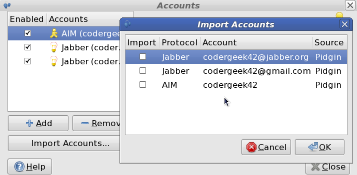
Also, I just noticed tonight that Empathy has recently acquired some auto-import functionality for migrating accounts from Pidgin. It’s still a bit in its infancy (only login details at the moment, for example; no conversation logs or other fancy stuff), but it is an excellent start! Many thanks to Xavier and the rest of the Empathy/Telepathy developers for continuing to make things that much nicer!
So to whom do I owe the drinks this time? 🙂
